
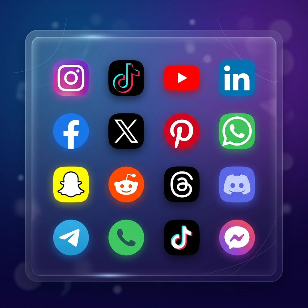
Almost every website has a row of social media links in the footer, but the way most designers build them is a complete mess. You either see blurry, low-res PNGs, massive web font libraries loaded just to display three tiny icons, or downloaded SVGs with broken viewBox attributes that crop the logos in half.
Even worse, many sites search for "free icons" only to fall into licensing traps where the creator demands a do-follow link on every single page of your site, or sends a copyright bill months later. I spent a week reviewing common free social media icon sets, analyzing their code bloat, and checking their hidden license terms.
Here is my raw critique of the best databases, minimalist packs, and creative sets, along with how to add them to your site without hurting your Google PageSpeed scores.
- Beware the FlatIcon trap: Free downloads require an attribution link in a prominent place on your site. If you do not want the clutter, buy a premium license or use CC0 icons.
- Clean your SVGs: Exported vectors from Figma or Illustrator often contain junk code, absolute colors, and bloated XML wrappers that you should strip out.
- Keep it up to date: Make sure the pack you choose includes the modern Twitter 'X' logo and the current Instagram layout instead of outdated 2018 designs.
- Match the strokes: Do not mix filled icons with thin line icons in the same row. It looks messy and unprofessional.
Free Icon Databases: The Good and the Scams
If you need a specific logo, these large search engines are where you will likely look first. But they are packed with dark UX patterns and tricky licensing terms:
A massive library, but the free plan is a minefield. You have to attribute the creator exactly how they specify, which is a headache for client sites. The site is also loaded with ads disguised as download buttons.
Visit FlatIcon →This is a designer favorite. It has nearly 400 clean black-and-white icons. The interface has no annoying popups, and the licensing is simple with no attribution required for commercial use.
Visit Iconmonstr →A great directory for finding 3D and stylized designs. However, the free filter is unreliable. Many icons listed as free actually require a premium subscription to download high-res files.
Visit IconScout →A solid option if you need to browse different color themes. Make sure you set the search filter to "No Link Back" to filter out creators who demand attribution links.
Visit Iconfinder →Minimalist Icon Packs That Do Not Bloat Your Code
Minimalist sets are the safest option for professional layouts. They fit footers without drawing too much attention. Here are the ones I recommend:
Simple, solid black shapes that look great when you need them to sit quietly in a footer. The spacing is very consistent.
Get the Pack →A set of clean line drawings. Great for sites with white backgrounds, but make sure the thin lines stay readable on mobile.
Get the Pack →Solid black shapes that scale down well. Even at 16px, these remain recognizable on tiny screens.
Get the Pack →Lines contained inside soft gray boxes. Perfect if you need uniform boundaries for your buttons.
Get the Pack →Uses a dual-shade gray effect. Gives a subtle depth without resorting to bright colors that clash with your brand.
Get the Pack →High-contrast white logos inside solid black circles. The easiest way to make sure your links are large enough to tap on touchscreens.
Get the Pack →Creative Icon Packs for Specialized Sites
If you are building a creative portfolio, a gaming hub, or a lifestyle blog, standard black icons can look boring. These packs add some flair:
Hand-drawn style. It looks human and friendly, making it a great fit for personal blogs and handmade shops.
Get the Pack →Trendy line drawings with a smooth gradient shift. Ideal for tech startups or digital agencies.
Get the Pack →Bright, round graphics with a glassy bubble effect. Fun for community-driven web pages.
Get the Pack →Slightly messy pen sketches inside rounded squares. Adds a textured, organic feel to your layouts.
Get the Pack →Logos placed on fluffy colorful clouds. Playful and clean style for creative sites.
Get the Pack →Stunning 3D pins. These look fantastic but be careful, they are heavy files that can slow down your initial page load.
Get the Pack →Always check the file type. A PNG file is essentially a grid of pixels. If you scale it up, it becomes blurry. An SVG file is a set of math instructions. You can scale it to the size of a billboard and it will remain pixel-perfect.
Here is the remainder of our curated collection, chosen because they offer balanced dimensions and clean vector shapes:
Flat graphics using the exact official brand colors. Safe choice if you want instant brand recognition.
Get the Pack →Refreshing color scheme that works well for eco-friendly or health-focused websites.
Get the Pack →Muted, pastel backgrounds with clean black logos. Very classy and easy on the eyes.
Get the Pack →Icons enclosed in high-energy circular lines. A cool choice for gaming or technology pages.
Get the Pack →Logos placed on geometric starburst badges. Very bold and attention-grabbing.
Get the Pack →Glittery, sparkling pink icons. Fits fashion, beauty, or lifestyle blogs perfectly.
Get the Pack →Glossy gold metallic finish. Adds a premium look to high-end consulting or luxury brand sites.
Get the Pack →Looks like physical stickers with a white border. Gives a modern, casual look.
Get the Pack →Clay-like textures. It looks like it was molded by hand, giving your site an artistic vibe.
Get the Pack →A large set featuring flat designs in professional, business-friendly colors.
Get the Pack →Soft, warm pastel shapes. Friendly design that works well for educational or children's sites.
Get the Pack →16 simple, flat icons utilizing the standard official colors of each platform.
Get the Pack →Circular badges in brand colors. A reliable option that looks great in any side menu.
Get the Pack →Features a clean, modern flat look with a subtle drop shadow casting across the button.
Get the Pack →White logos in solid black square frames with rounded corners. High contrast and clean.
Get the Pack →Rounded squares in official brand colors. Perfect if you need a standard, recognizable set.
Get the Pack →Includes modern platform variants in crisp vector formats. No outdated logos here.
Get the Pack →Hand-drawn circles enclosing social symbols. Very friendly and casual.
Get the Pack →Simulates real plastic 3D buttons. Looks good on modern landing pages, but can feel dated on flat layouts.
Get the Pack →A versatile bundle containing black-and-white, gray, and official brand color choices.
Get the Pack →Sleek icons using dotted outline strokes. Very unique, but harder to read at smaller sizes.
Get the Pack →Solid black boxes containing white logo marks. Extremely reliable and clean.
Get the Pack →Basic logos in both high-resolution color and monochrome versions. Ideal for corporate footers.
Get the Pack →Round buttons with soft, colorful gradients in the background. Modern and stylish.
Get the Pack →How to Code Your Icons for Fast Page Load
The way you add icons to your website changes how fast it loads. Here are the two best options, depending on your design needs:
Option 1: Inline SVG (The Professional Way)
Copy the SVG code directly into your HTML document. This is the best method because it does not require a separate network request to load an image file, which speeds up your page rendering. It also lets you use CSS to change the icon color when someone hovers their mouse over it.
Option 2: The HTML Image Tag (The Easiest Way)
Save the SVG or PNG file to your project folder and link to it using a standard image tag. Make sure you set explicit height and width values to prevent layout shifts as the page loads.
Choosing a Style That Matches Your Brand
Do not just pick a pack because it looks cool. The style should fit your company's vibe:
Quick Checklist Before Uploading Icons
- Is the viewBox viewport set correctly? Open the SVG in a browser to make sure the edges are not cropped or cut off.
- Are the files optimized? Use a tool like SVGOMG to strip out junk code and XML warnings from your vector files.
- Do the icons have equal visual weights? A thin line icon looks out of place next to a solid, bold circle. Stick to one style.
- Does the license permit commercial use? Verify the licensing terms if you are building a site for a client.
Licensing Realities and Trademark Guidelines
Many "free" packs on directories like FlatIcon or Freepik are free for personal use, but require you to buy a premium license or add a visible backlink to the creator's profile if you use them on a commercial site. If you skip this, you violate their copyright terms.
There is also the issue of brand guidelines. Tech companies like Meta, LinkedIn, and X have strict legal rules about how their logos can be modified. Technically, changing the color of the Instagram logo to match your website's pink color scheme violates their branding policy. While small websites rarely face legal action for using monochrome or custom-colored icons, large commercial projects should always stick to the official, unaltered brand assets.
For example, make sure you check the official Twitter (X) brand guidelines when you update your footer buttons. Many free packs still use the old blue bird logo, which looks outdated and unprofessional.
Be careful with free vector downloads from untrusted sites. Some ZIP files contain hidden malware or scripts, and others might look like free icons but carry copyright traps designed to extract settlement fees from business sites. Stick to trusted libraries.
Frequently Asked Questions
It depends on the individual pack license. CC0 or public domain sets are completely free to use anywhere. Other packs on sites like FlatIcon require a premium membership or a visible attribution link to the creator on your page.
This usually happens because the viewBox attribute in the SVG code does not match the actual width and height variables of the paths. Opening the SVG in an editor like Figma and re-exporting it with "Outline Strokes" turned on will usually fix this.
Always choose SVG when possible. SVGs are vector shapes, which means they are extremely small, load faster, and stay perfectly sharp on high-density Retina displays. PNGs should only be used as a backup if you cannot find a vector version of a complex 3D graphic.
Technically, no. Major companies have strict brand guidelines that prohibit altering their official logo colors. While small websites rarely face legal action for using monochrome or custom-colored icons, large commercial projects should always stick to the official, unaltered brand assets.
My Recommendation
Taking the time to select and optimize your icons keeps your website running fast and looking professional. If you want to make sure your website copy is just as polished as your design, check out our guide on AI tools for content creation.

Priyanka Kumari
Priyanka Kumari is a digital strategist and content creator who focuses on how we work. She has spent years testing the latest tech to find what truly helps people work better, not just faster. When she is not testing apps, she is likely reading a book or walking a new trail.
Read more articles by this author