There is nothing more frustrating than spending hours editing a photo in Lightroom or designing a graphic in Canva, only to upload it to Instagram and watch the app turn it into a blurry, pixelated mess. If you've ever had the text on your Reel cut off by the phone's UI, or wondered why a portrait shot looks muddy on a high-res mobile screen, you've experienced the wrath of Instagram's compression algorithms.
In 2026, Instagram is essentially a vertical-first app. While the classic square format is still alive, vertical photos and full-screen videos get the most real estate and engagement. This guide is a practical, tested breakdown of the exact dimensions, aspect ratios, and export settings you need to keep your profile looking professional. Because just like figuring out the when to post on Instagram, uploading your assets in the correct canvas size is essential to a successful strategy.
- Stick to 1080px width: Anything wider gets aggressively compressed by the app; anything narrower gets stretched and blurred.
- Use 4:5 for feed photos: Portrait posts take up 27% more screen space than square posts, capturing more attention as users scroll.
- Mind the Reels UI safe zone: Keep captions and key visual elements within the center 60% of your 9:16 video to avoid text overlaps.
- Verify the profile crop: X displays Reels covers as 1:1 squares or 3:4 crops on your profile grid. Center your titles accordingly.
- Carousels inherit slide dimensions: Every slide in a carousel is sized based on the aspect ratio of the first slide you upload.
The Evolution of Instagram Dimensions
Back in the day, Instagram was simple. You uploaded a square photo, threw a heavy filter on it, and called it a day. The strict 1:1 aspect ratio was a nod to Polaroid cameras and defined the platform's early aesthetic. But as mobile screens grew taller and cameras became more sophisticated, that square box started to feel like a cage.
In 2015, Instagram unlocked landscape and portrait posts, giving creators more room to breathe. The massive shift, however, came with the introduction of Stories in 2016 and Reels in 2020. Suddenly, the vertical 9:16 format went from a niche orientation to the default layout for the entire app. Today, Instagram is a vertical ecosystem where visual weight and screen coverage dictate how long a user stays on your content.
In 2026, the stakes are even higher. High-density retina screens and HDR support mean that uploading low-resolution images is immediately noticeable. If you want your feed to look premium, you can't rely on old standards of 640px or 800px. You need clean, pixel-perfect assets exported specifically for the app's modern layout.
The Basics: Aspect Ratios vs. Pixels
Before we dive into the specific numbers, let’s quickly clear up the two concepts that trip up most creators: aspect ratios and pixels.
Aspect Ratio is the proportional shape of your image or video, written as "Width:Height". A 1:1 ratio is a perfect square. A 4:5 ratio is a tall rectangle. A 9:16 ratio is a narrow, vertical rectangle. If you upload a file with an unsupported aspect ratio, Instagram will crop it automatically—often cutting off heads, feet, or important text.
Pixels represent the physical resolution of your file. An image that is 1080 x 1350 pixels has a 4:5 aspect ratio. If you resize that image to 2000 x 2500, the ratio stays exactly the same, but the file size and raw resolution increase. Instagram recommends a standard width of 1080 pixels for feed content. If your file is too small, it looks pixelated. If it is too large, the app's compression engine will shrink it, introducing compression artifacts.
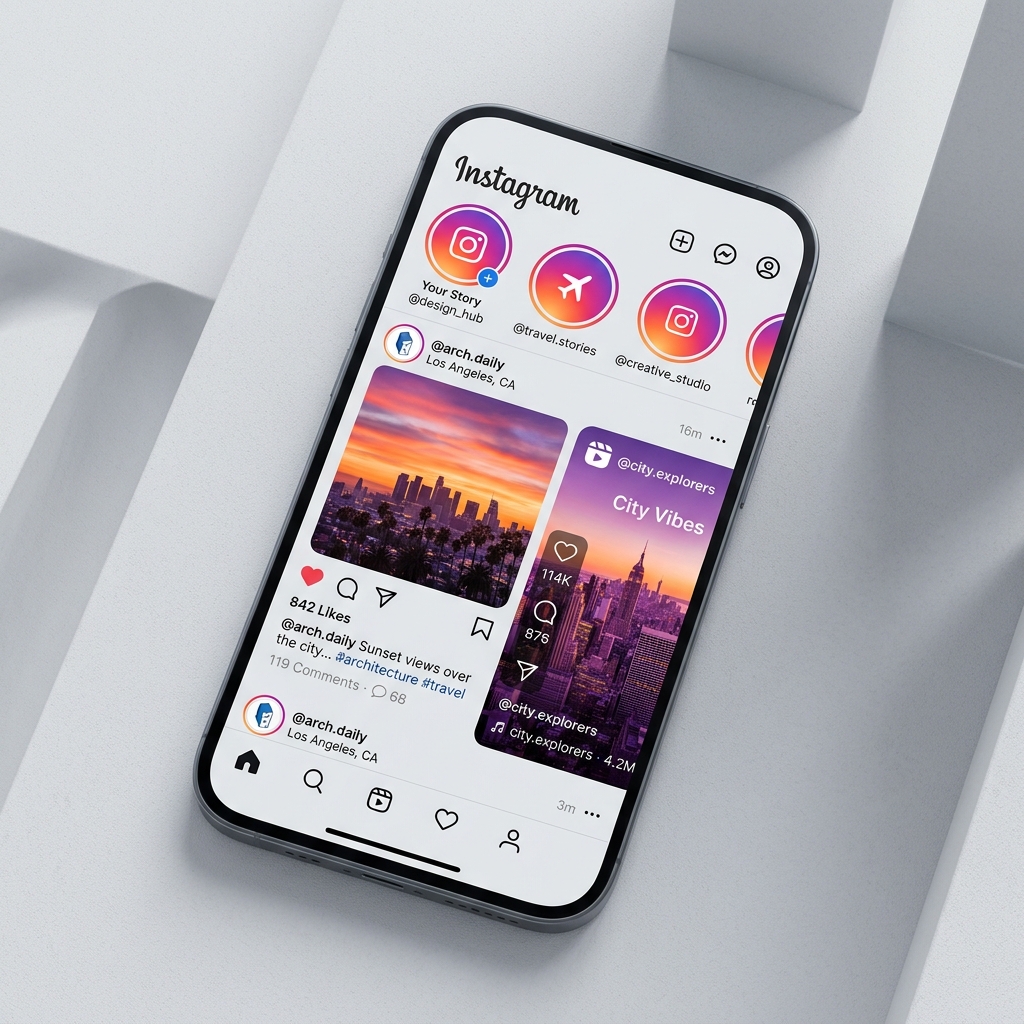
Instagram Feed Post Sizes (The Three Choices)
When posting to the main feed, you have three distinct layout options. Here is how they compare in practice.
1. Square Feed Posts (1:1 Ratio)
The square is still the default choice for many brands. It is clean, predictable, and matches the profile grid layout perfectly.
Because square images have no vertical bias, they force the viewer's eye to the center of the frame. If you're posting infographics, quotes, or simple product photos, the 1:1 ratio is highly effective. It also ensures that what users see in the feed is exactly what they see on your profile grid.
2. Portrait Feed Posts (4:5 Ratio)
If you are posting photos or static designs, portrait is the best format to use.
By using a 4:5 ratio, your post covers significantly more physical screen space on a phone. This pushes other posts out of view and keeps the user's attention focused entirely on your content. The only catch is the grid crop: because your profile grid is square, Instagram will trim the top and bottom of your 4:5 image. Keep your main subject and any critical text centered to prevent them from getting chopped on your profile.
3. Landscape Feed Posts (1.91:1 Ratio)
Landscape is the widest format available, but we generally advise against using it on the main feed.
Because landscape posts are short, they occupy very little screen space. A user can scroll past them in a fraction of a second. If you have a wide panoramic shot, a better approach is to place the landscape photo inside a 1080 x 1350 portrait canvas with a solid background, or split the image across a carousel.
If you're uploading a 4:5 portrait post, always use the "Adjust Grid" tool during the upload process. This lets you manually select the square crop that will appear on your profile tab, so you don't end up with an awkwardly cropped head or text cut in half.
The Vertical Revolution: Stories and Reels
Vertical format is the lifeblood of modern Instagram engagement. Both Stories and Reels are designed to fill a smartphone screen completely.
Instagram Story Dimensions and Safe Zones
Stories are ephemeral, vertical posts that disappear after 24 hours. Because they fill the screen, they require a 9:16 layout.
The biggest pitfall with Stories is placing text or stickers too close to the edges. X overlays the profile icon and progress bar at the top, and the text entry box at the bottom. If you place elements in these zones, they will clash with the UI or be covered entirely. Keep all text, links, and tags within the center safe zone (leave 250px of empty space at the top and bottom). This guarantees that everything remains legible across different phone screens and prevents issues with Instagram story navigation.
If you're sharing links, always keep the link sticker near the middle of the screen. If you put it too low, users might accidentally trigger the system menu when trying to tap it. Also, keep in mind that users sometimes screenshot slides to save info, so check if Instagram notifies for story screenshots before posting highly sensitive design templates.
Instagram Reels Dimensions and Thumbnails
Reels are the primary engine for organic reach on Instagram today. They share the same 9:16 format as Stories but require different thumbnail management.
A common mistake is designing a Reels cover that looks great in full screen but looks horrible on the profile grid. On your profile page, Instagram crops the cover to a 1:1 square (or a 3:4 rectangle for the Reels tab). If your cover has a title at the very top or bottom, it will be cropped out.
To solve this, design your cover in a 1080 x 1920 template, but keep the title and focal point inside a 1080 x 1080 square in the dead center. This ensures your cover looks clean in the feed, on the Explore page, and on your profile grid.
Instagram Carousel Post Sizes (The First Slide Rule)
Carousels allow you to upload up to 10 photos or videos in a single swipeable post. They are excellent for storytelling, step-by-step guides, and photo dumps.
However, carousels have one strict limitation: **the first slide dictates the size of all subsequent slides**. If your first image is a 1080 x 1080 square, every other slide will be cropped to a square, even if they were originally exported as portraits.
To avoid awkward crops, make sure all the files you plan to upload share the exact same aspect ratio (ideally 1080 x 1350 portrait). If you have a mix of landscape and portrait images, use design tools to place them on matching 4:5 canvases before exporting. You can find some AI tools for content creation useful for automating these canvas adjustments.
Profile Assets: Photos and Grid Previews
Your profile page is the landing page for your brand. A pixelated avatar or messy grid layout makes your account look spammy or neglected.
Instagram Profile Photo Size
Your profile picture is displayed as a circle, but you must upload it as a square.
Because the app crops the corners of your square upload, leave plenty of breathing room around the edges of your logo or face. Keep the main subject centered. If your logo has text, make sure the text is large and clear enough to read as a tiny icon on a phone screen. High-contrast colors work best to make your icon pop in comment sections and notifications.
Profile Grid Previews and Layouts
Your grid is your aesthetic resume. While the classic grid is made of 1:1 squares, Instagram has been testing a 3:4 vertical grid preview for many creator profiles in 2026. This means designing your posts so they look good in both square and vertical preview formats is the safest way to future-proof your layout.
Instagram Ad Sizes
If you are spending money on paid reach, getting the dimensions wrong is expensive. Poorly formatted ads lead to lower click-through rates.
- Feed Ads: Use 1080 x 1350 portrait. It takes up the maximum screen space, making your call-to-action button more prominent. The Meta ad platform has strict rules about text density, so keep copy brief and highly visual.
- Story & Reel Ads: Use 1080 x 1920 pixels. The safe zone is even tighter here because Instagram places a "Sponsored" label and interactive elements at the bottom. Keep your hook and call-to-action within the middle 60% of the canvas.
Quality Maintenance and Compression Tips
Even if you use the correct dimensions, Instagram’s compression can still ruin your quality. Follow these export settings and settings tweaks to keep your images sharp:
Enable "Upload at Highest Quality"
Go to Settings > Account > Data Usage and ensure "Upload at highest quality" is toggled on. If this is off, Instagram will downsample your uploads on slower cellular networks to save bandwidth.
Lightroom Export Settings
For portrait photos, export as a JPEG, color space sRGB, short edge limited to 1080px, and quality set between 75-80%. Exporting at 100% quality or higher resolutions forces Instagram to do the resizing, which often looks worse than doing it yourself.
Export PNGs for Text and Logos
If your post is a graphic with text or flat illustrations, export as a PNG. This prevents the blurry "ghosting" artifacts that occur when JPEGs are compressed by the app.
Shoot in High Framerate for Reels
Record video at 1080p at 60fps or 4k at 30fps. Instagram does not support 4k playback, but uploading a high-bitrate 4k file downsampled to 1080p yields a much cleaner result than uploading native 720p or low-bitrate 1080p.
Tools for Sizing and Optimization
You don't need a heavy design background to handle these formats. Here are the tools we use daily:
- Canva: The easiest way to get started. It has preset canvases for "Instagram Story" and "Instagram Post (Portrait)" that are pre-configured to 1080px widths.
- Lightroom Mobile: Ideal for cropping and color correction on the fly. You can create custom export presets for Instagram dimensions.
- InShot: Our go-to mobile editor for Reels. It lets you set a 9:16 canvas and add clean borders to horizontal videos so they don’t get cropped awkwardly.
- Snapseed: Has a great "Expand" feature that uses AI to extend background space if your photo is too narrow for a 4:5 crop.
- Instagram Caption Generator: Once you have the visual aspect locked in, using a dedicated Instagram caption generator ensures you write a compelling copy that matches the visual polish of your post.
Frequently Asked Questions
Use 1080 x 1350 pixels (4:5 aspect ratio) for feed photos. It covers the maximum amount of screen space as users scroll, giving you a better chance of grabbing their attention than a square or landscape photo.
This usually happens for two reasons: either your file resolution was too low (below 1080px width), causing the app to stretch it, or it was too high (like a raw 40MP camera file), forcing Instagram’s servers to heavily compress it. Stick to a width of exactly 1080px and make sure "Upload at Highest Quality" is toggled on in your app settings.
Yes. Open the Reel, tap the three dots on the right, select "Edit", and tap "Edit Cover." You can choose a new frame from your video or upload a fresh image from your phone's camera roll.
The standard size is 1080 x 1920 pixels. The safe zone is the middle area, meaning you should leave 250 pixels at the top and bottom free of text, stickers, or links so they don't get covered by the app's UI.
With Instagram rolling out vertical 3:4 grids to replace the legacy 1:1 square grid on many profiles, you should make sure your posts look good in both aspect ratios. Center your focal points so that whether the user is seeing a square or vertical preview, the subject isn't cut off.
No, it actually does the opposite. Uploading a massive file (e.g. 5000px wide) forces Instagram's compression algorithms to downsize it to fit their server requirements, often leaving the image looking muddy. Exporting your file at exactly 1080px wide gives you control over the compression quality.
While there is no official limit, files over 30MB can fail to upload or suffer from heavy compression. For static images, keep JPEGs under 10MB. For Reels, compress the video to keep the file size as low as possible while maintaining a high bitrate.
Use PNG for text-heavy graphics, illustrations, and logos to avoid compression artifacts around the text. Use JPEG for standard photographs to keep file sizes low and colors rendering naturally.
Instead of posting a single wide image, crop the panorama into multiple 1080 x 1350 portrait panels and upload them as a carousel. This allows users to swipe through the seamless horizontal view at full height, maximizing detail and engagement.
This is a color space mismatch. Instagram reads the sRGB color profile. If you export your photos in Adobe RGB or ProPhoto RGB, the colors will look washed out or dull on mobile devices. Always convert your color profile to sRGB when exporting from Lightroom or Photoshop.
Upload your avatar at 320 x 320 pixels. Since the app crops it into a circle, keep any logos or faces centered with plenty of space near the corners to avoid clipping.
To Wrap Up: Quality Wins
Optimizing your Instagram sizes isn’t just about memorizing aspect ratios; it's about eliminating the technical friction between your creative work and your audience. By mastering these rules—exporting at 1080px wide, designing within safe zones, and keeping your profile photo centered—you ensure that your brand looks professional, polished, and trustworthy.
Keep in mind that Instagram updates its UI regularly, so get into the habit of double-checking your profile tab on a couple of different phones to see how your cover templates are rendering. Take control of your file export parameters, enable high-quality uploads in the app, and let your visuals stand out.

Amisha Pant
A dedicated freelance writer with a focus on delivering high-quality content tailored to enhance online engagement. With expertise in AI, digital marketing, technology, or business strategy.
Read more articles by this author